Designing a Website That Unifies the Company Brand
Learn how you can design a website that is engaging and reflects the company brand guidelines of your client.
Get a Free Marketing Analysis and Consultation
Nowspeed can review your Website, SEO, PPC, Email or Social Media Campaigns and identify ways to make an immediate impact!
It is easy—as long as you let your personality show—to create a website based on design trends of the year. Popular trends of 2019 included 3D typography, asymmetrical layouts, custom illustrations, and duo tones. 2018 featured gradients, ‘80s and ‘90s color palettes and patterns, and heavy use of animations and GIFs.). Many designers will call it a day when they have arrived at a trendy, thoughtful, well organized, and clean website design.
While these are all necessary ingredients of any well-designed website, it is also very important to execute designs using the brand identity and maintaining brand consistency as well.
One key goal of any website design is to immediately engage users with recognizable visuals, layouts, and messaging. Because there are likely hundreds or even thousands of businesses in your industry that offer a product or service just like yours, your website design must reflect the attributes that define your company—those specific details that make you different from the competition.
Visuals are very important for brand recognition. Consider the following not-so-random words: yellow, arches, and smile. Remind you of a certain fast food restaurant? Companies like McDonald’s, Nike, and Chanel have logos and design elements that are immediately recognizable. Every successful brand is made up of unique colors, typographic styles, photography, and established tone.
While not all of us are mega corporations—Nowspeed certainly isn’t—brand identity and brand consistency are extremely important when it comes to website design. If you follow trends, or design from a template, you’re likely to get lost in the vast sea of trendy, templated websites and logos. But if you define your company and set out to create a design based on that definition, you’ll wind up with both visuals and a website design that truly stand out and represent your company.
That’s what brand identity and consistency is all about: figuring out what makes you…you, and designing with that in mind from start to finish.
Here are some tips to maintain brand consistency when designing your website.
Establish your color palette, but don’t go too crazy, as too much use of color can distract from other elements that tell the story of your business.
Determine which colors are your primary and secondary colors and use them accordingly. Secondary colors should only be used as an accent to highlight pieces of information or draw attention to areas within a section.
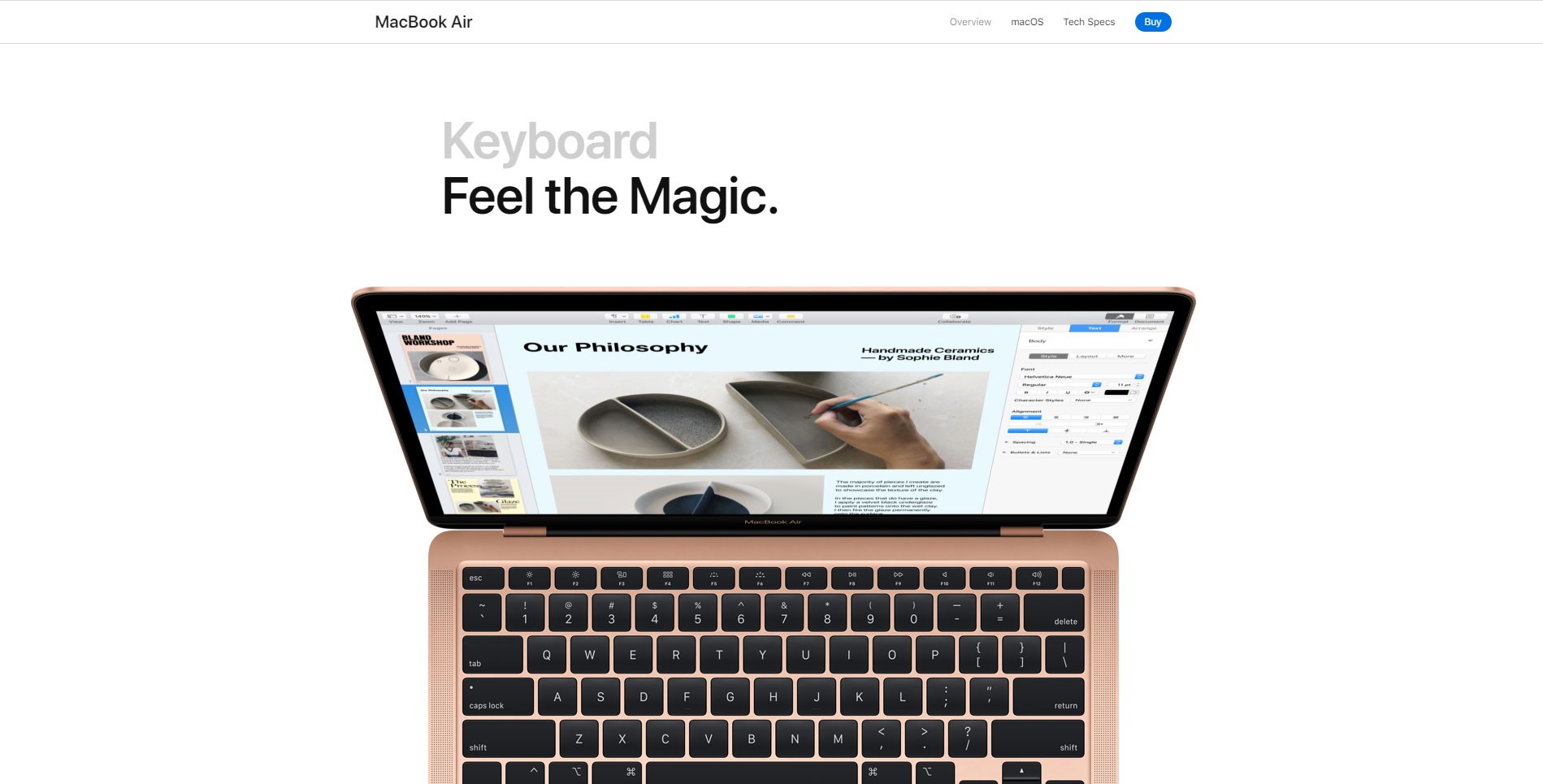
Decide whether you want your site to have a lighter or darker background. This will reflect the tone of your brand and how you want to be perceived. Darker backgrounds can provide a sense of luxury, intimidation, strength and confidence but are paired better with less content and more visuals due to readability concerns.
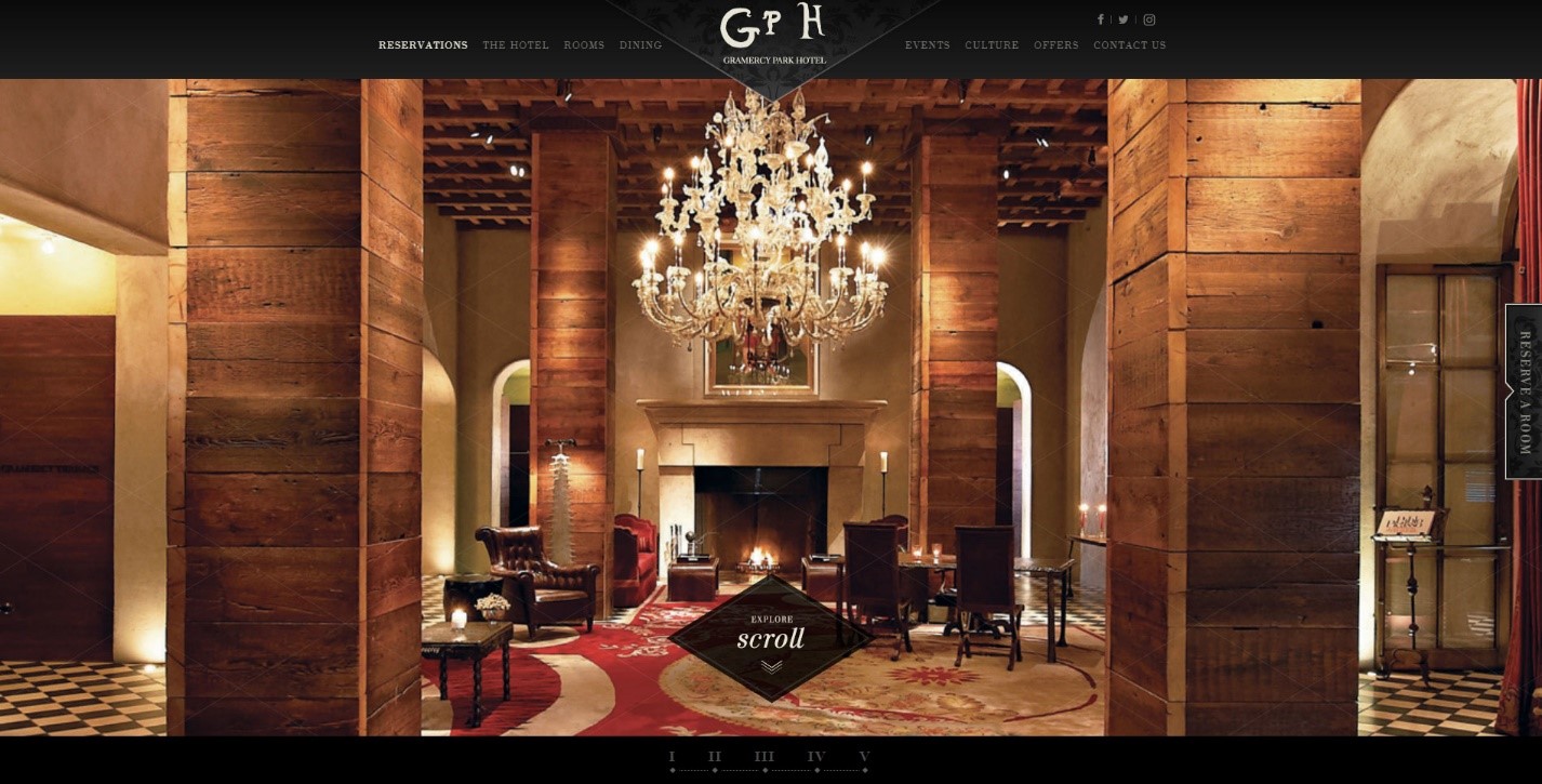
The website for the Gramercy Park Hotel in New York City (above) uses black to project all those qualities of wealth and luxury, while the product page for Apple’s MacBook Air (below) utilizes lighter backgrounds to give a sense of clarity, understanding, and welcome that also allows for more content to be displayed and provides emphasizes the product imagery.
Color should be used sparingly and in a well thought-out manner to draw attention to important content without distracting from the main message. Also, keep in mind that you are likely going to want to use photography on your website. If the story is being told through images, you don’t want multiple colors to distract from that story.
Use elements of your logo as a visual embellishment that helps make your website’s style and design more unique.
Your logo is the face of your brand. It’s usually the first thing that people see. If there are embellishments in the logo, these are good opportunities to use it throughout the site for highlighting sections or pieces of text.
![]()
If your logo is unique due to typography choices, you can reuse that stylistic choice throughout the site in headers or call out text.
Your logo will help you establish the feeling and tone of your brand. It emphasizes its importance and constantly seeing these elements throughout the site will remind the user of who you are. By using it throughout the site—both functionally, as part of the header menu linking back to your homepage, and as an accent for site elements and imagery—it shows that your logo is not just a random symbol, but rather is tied into the identity and feel of your business.
![]()
Choose a typeface that reflects your company culture and how you want to be perceived.
The various styles of typefaces can be used to further tell the story of your brand and establish your brand as possessing certain qualities (professional, luxurious, helpful, experienced, etc.). This is where you really have to think about how you want the company to present itself. Refer to this article about choosing the right typeface for your brand and appropriate typeface pairings by Pixelsurplus.
![]()
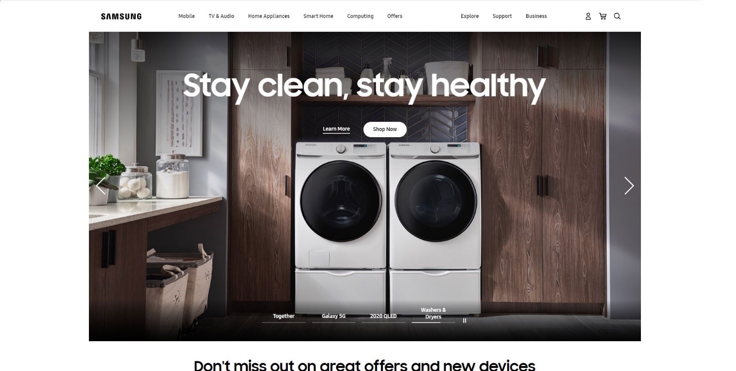
If you are a tech company, you may choose a sans serif typeface that is very simple and easy to read to show that you are straight to the point, experts in what you do, personable and easy to approach.
For example, Samsung’s website uses a thicker sans serif typeface that makes the content extremely legible and clear, while also giving the sense that their products are durable. The hint of personality seen on the “t’s” makes them more approachable and shows they stand out from other companies. The shortened heights of the “H’s”, “T’s, and “L’s” give a sense of stability and reliability.
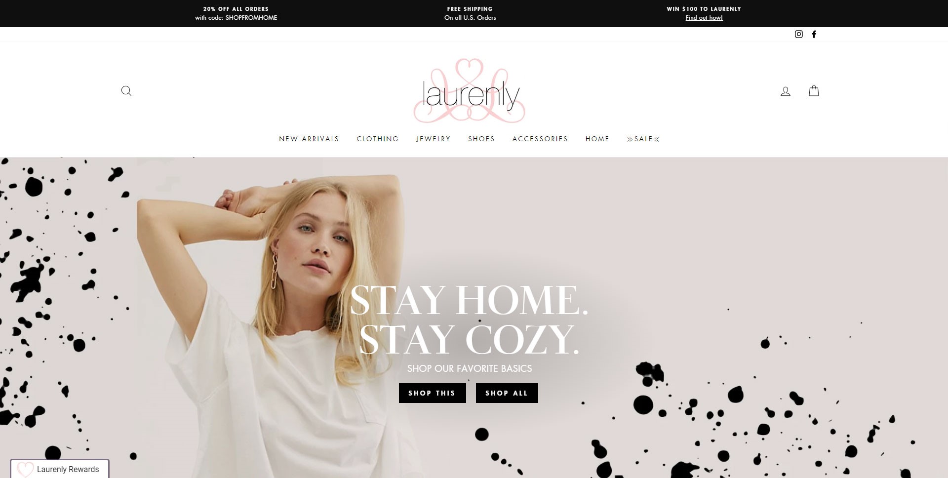
If you are a boutique clothing store, you may want a typeface that is more elegant, captures the eye with its unique qualities, and gives a sense of establishment. In this case it could be a serif or calligraphic typeface that sets you apart from other boutique clothing stores and reflects the styles of clothing you offer (ex. clothing inspired by nature and florals, sleek professional looks, comfortable fun-loving designs, etc.).
When looking at the Laurenly Boutique website, the serif typeface with varying line widths and subtle variations in individual letter design give a sense of high-class quality, attention to detail with their clothing, and femininity. The smaller sans serif typeface complements this look very well with its simplicity and slight roundness, offsetting the harsh edges of the serif typeface. They use the secondary font in a way that whispers information to the user and entices them to feel a sense of intrigue as to what Laurenly has to offer.
Setting photography and illustration standards ensures that the visuals support your brand’s story.
Photos are excellent ways to support your brand story, and can even serve as the main means of telling it. User’s eyes are drawn to visuals, and it is important that images and illustrations throughout your site continue to reflect the established tone of your website.
Make decisions on how you want photos to be oriented, the composition within the photos, whether you want a warmer or cooler color scheme for each shot, and how the subjects in the images should be focused on. Keeping these things in mind will help support your content, and help users better understand what your company does and what you strive to do for them.
As for illustrations, infographics, and icons, a certain style needs to be set that follows the tone. If you are going for a professional and clean look, thin lines with not too much detail are best.
![]()
If you are going for a playful and exciting story, thicker lines, with more color, and detail will support that narrative.
![]()
With these four points in mind, you can transform a general template into a site that reflects the essence of your brand and creates a consistent, memorable story.
So let's
talk.
We're always excited to dig into the details of your company and what strategy can help you meet your goals. So let's talk and lay out a plan for success!