The Ultimate Guide to Facebook Ad Creative
It all starts with a click. Here's how to create scroll-stopping Facebook ads that grab attention, build interest, arouse desire, and cause action.
Get a Free Marketing Analysis and Consultation
Nowspeed can review your Website, SEO, PPC, Email or Social Media Campaigns and identify ways to make an immediate impact!
Facebook ad creative has never been more important.
It’s always been important, and perhaps even underrated compared to some of the sophisticated audience targeting options that have gained notoriety over the last few years. Many advertisers have been using Lookalike Audiences and retargeting audiences with sophisticated retention windows to great effect.
But the Apple iOS 14.5 update just dealt a major blow to advertisers depending on that type of audience targeting—which we’ll discuss more in a minute—but the truth is it was a long time coming.
Forward thinkers have been wondering what it might be like to advertise in a ‘cookie-less’ world since the European Union put the General Data Protection Regulation into effect in May of 2018. Or possibly even before that in 2014 when Facebook came under scrutiny for ‘running experiments’ on its user base, or even the Cambridge Analytica scandal of 2016.
Data privacy is a hot topic right now and it has finally moved from theory to practice, meaning advertisers are feeling the negative effects. So what’s the solution?
Focus on better Facebook ad creative.
Creating better ads isn’t the only way to combat less sophisticated targeting, but it’s the best and first thing you should do. That said, this post is all about using the tools available to you—both inside Facebook Ads Manager and inside the psychology of your audience—to get better results with your Facebook ads.
If putting the right message (ad creative) in front of the right audience (targeting) is the goal, you need to get the ad creative right first.
In this post, we’re going to do a deep dive on Facebook ad creative and give you some extremely actionable tips you can use to boost your CTR and lower your CPA. Oh, and *spoiler alert* we’ll also throw in a bonus copywriting framework you can use to write effective copy every time.
But before we get to the actionable stuff, it’s actually super important to understand why you even need good Facebook ad creative in the first place.
Let’s go!
The Importance of Facebook Ad Creative
If you’ve read any of the other Facebook ads content on this blog or heard me speak on the subject, you know that I view Facebook ads as a component of a larger marketing picture. Ads, landing pages, web content, and email are all crucial for success.
But if you can’t get a person to click your ad, the rest of your funnel doesn’t matter because they’ll never see it. In that sense, you need to get the ad creative right in order to even have a shot at converting a visitor into a lead or customer.
So how can you measure good Facebook ad creative? Easy, just look at the click-through rate (CTR).
- If your CTR is above 2%, your ad creative has done its job admirably
- If your CTR is below .5%, you need to go back to the drawing board
Note—A successful advertising campaign depends on other metrics, particularly cost-per-acquisition (CPA) and cost-per-thousand-impressions (CPM), but those aren’t affected by ad creative as directly as CTR. Your landing page experience is largely responsible for CPA, and CPM is affected by targeting and other factors. Since this post is about ad creative, let’s focus there.
As we mentioned, the reason Facebook ad creative is so important today is that the privacy updates with iOS 14 have stripped advertisers of some of their advanced audience targeting tools. This is affecting ad delivery and reporting, and all you have to do is browse #FacebookAds Twitter to see how media buyers feel about it…
Since there’s nothing we can do about that, advertisers would do well to double down on ad creative. If you can’t display your ad to precisely the right audience at exactly the right time, you can make sure your ad stands out.
That said, let’s take a closer look at what makes a good Facebook ad.
The Anatomy of a Perfect Facebook Ad
Ever notice how there are very few bands that only use one instrument? Generally speaking, most bands have several different instruments that play in concert to produce a sound that’s greater than the sum of its parts.
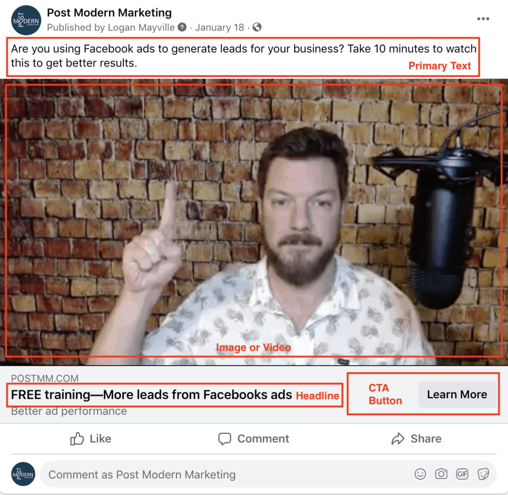
Facebook ad creative functions in the same way. There are four* main components that should work in concert in order to get you that click. The components are:
- Image or video
- Primary text
- Headline
- Call to action button
*There is also a link description, but this doesn’t display on mobile, which is where the majority of ads are shown.
In order to make sure all four components are working together, you first need to understand an older, yet timeless, advertising concept:
Attention > Interest > Desire > Action
AIDA is the classic decision-making process that all humans go through in response to advertising stimuli. It can happen in as little as one second, but it happens before every single click.
And each of the four Facebook ad creative components is responsible for each of those four steps.
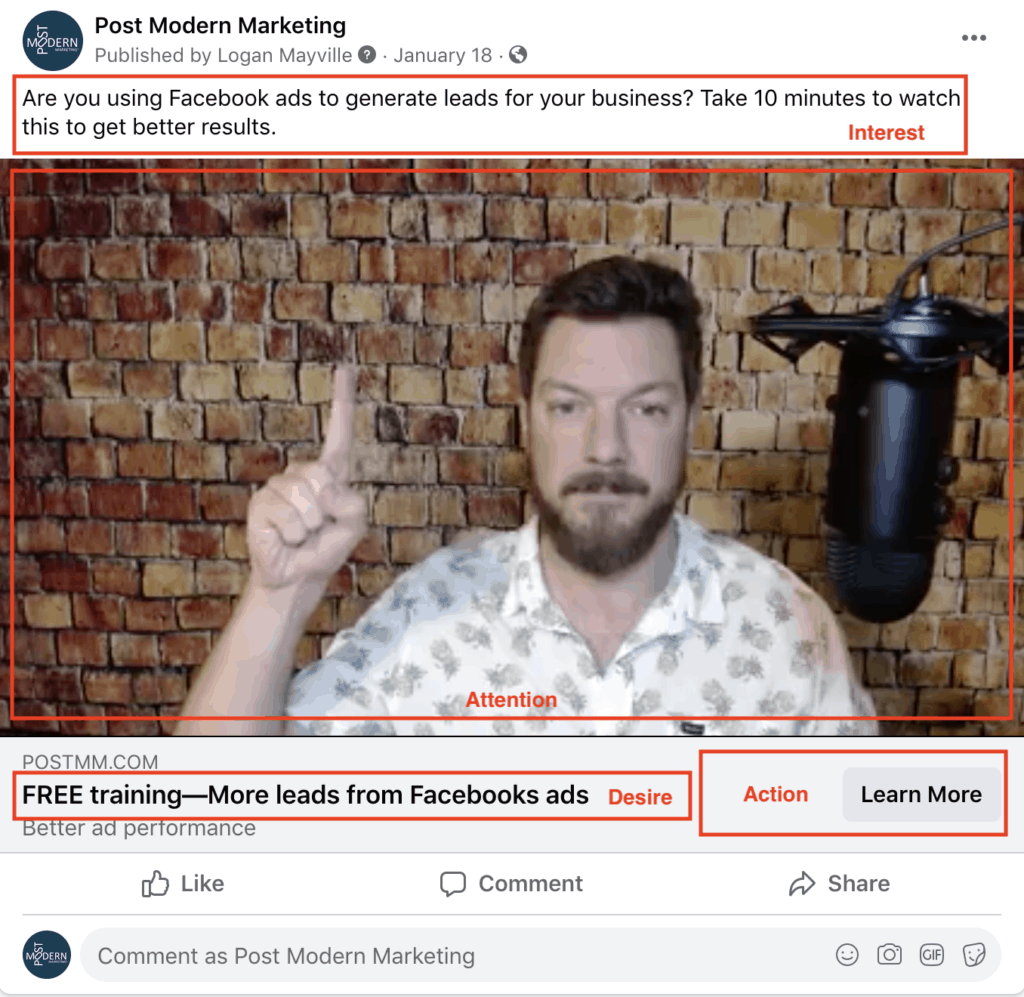
If you make sure that each component is optimized to do the job it’s assigned, you’ll be well on your way to CTRs of 1-2% and up. Let’s break down each ad component one at a time.
Attention = Image or Video
When it comes to Facebook ads, the “attention” step in AIDA can be thought of as stopping the scroll. Put yourself in the shoes of a Facebook user on her phone:
She’s SCROLLING with her thumb looking for content that interests her. What’s the first thing she sees? The image or video. This is because the brain can process an image faster than it can process text, so this is the natural first step.
The job of your Facebook ad image or video is to stop the scroll.
It can do a lot more than that, but if you’ve successfully stopped somebody from scrolling (aka got their attention), you’re doing better than the majority of advertisers. See, if somebody stops scrolling, their next move is to glance up at the primary text area, giving you a better opportunity to capture their interest, but we’ll get to that in the next section.
Here are a few key ways to get attention with your Facebook ad image or video.
Color – Images that are white, grey, or blue are going to wash out in the Facebook user interface. Bright colors are going to stand out more. The social media team who promoted Fyre Festival (lol) announced the event by having their influencers post a plain orange tile. I do not recommend this, but it shows the extreme end of the spectrum that color can have. Images that are white, grey, or blue are going to wash out in the Facebook user interface. Bright colors are going to stand out more.
Faces – Humans are naturally drawn to eye contact with other human faces. If appropriate, eye contact can help establish trust in your message.
High-contrast photos – By bumping up the contrast in your photos, you can have your images jump off the screen a bit more with sharper lines than the rest of the organic photos posted every day.
Motion – For videos, somebody walking is a great attention grabber. Where is he walking to? Not sure, but now I want to stick around and find out! Get it?
Text overlays – If you have a succinct message (fewer than 7 words) that complements your image, by all means, throw it on top with a text overlay.
And whatever you do, please don’t use stock photography out of the box. Nothing screams “Please keep scrolling!” louder than a stock photo of two guys doing a handshake in a corporate setting. This doesn’t mean don’t use stock photos at all, but consider bumping up the contrast, using a composite, or adding a text overlay.
Got their attention? Great—let’s build their interest.
Interest = Primary Text
You have their attention, now it’s time to build their interest. So how do you do that?
Effectively transfer a single, clear idea.
Notice that I didn’t say sell your product or service. No, that comes later. At this point, you do not have their trust, but you do have their attention. Invite them into your brand further by transferring a key idea.
What idea, you ask? Pick one:
- Fear
- Anger
- Happiness
- Intelligence
- Curiosity
- Success
Notice how these feelings are primal and not specific.
- Fear of loss is a powerful motivator: You may be spending too much on auto insurance.
- Anger causes action: Did you know thousands of whales are slaughtered every year?
- Everyone wants happiness: These sheets feel like a cloud.
And so on. There are dozens if not hundreds of different ways you can execute this technique, but the immutable law is:
Seek to imprint a single, clear idea into the minds of your audience.
DO NOT attempt to sell a laundry list of benefits.
DO NOT attempt to explain your product or service in detail.
DO NOT use multiple angles.
The key here is that you are not selling your product or service at this point—you are selling the click. Remember, your landing pages and website can help you sell your brand, but people first have to have enough interest to click.
In order to capitalize on the attention, you gained from your image or video, plant a single idea in their head. You can use a statement or even a question. In very limited cases, you can tell a story through a mini-blog post (sometimes referred to as “broetry”) but I only suggest this if you know your audience very, very well and you’re operating in a specific niche. Otherwise, keep your copy to one or two sentences.
If you’re looking for inspiration on primary text copy for Facebook ads, we have a proven framework we use at Nowspeed that I’ll explain in the next section.
But until then, let’s move onto the next step in our audience’s decision-making process.
Related reading: Launch Your Lead Generation With the Facebook Ads Two-Step
Desire = Headline
OK, so I fudged a little bit—it’s not always clear which part of your ad (the primary text or the headline) your audience will read first if you successfully stop them from scrolling past your ad. In that sense, it’s hard to separate interest and desire by headline or primary text.
Rather, here’s how I use the headline area:
Give the reader an obvious clue about what’s on the other side of their click.
What’s a Facebook user’s biggest fear? You guessed it—clicking on an ad only to have the page load slowly, be unreadable on mobile, or offer something other than what they were expecting. A whole 5 seconds of their life down the drain…
You laugh, but that’s hardly an exaggeration. In order to combat that fear, use your headline to give the person a convenient little bridge so they know what to expect.
- For e-commerce, this is a great spot to put a discount code + your product. That way, they know they’ll soon be looking at swimsuits for 15% off.
- For info products, let them know there is a free video training they can watch instantly.
- For lead generation, hint at the solution to the problem you’ve raised with your ad copy.
In order to pay off this desire you’ve aroused, you must be absolutely sure your landing page transitions seamlessly from your ad. If you offered a free video training, there had better be a video embedded on your landing page above the fold.
The concept of landing page ‘scent’ means your landing page should smell like the ad—considering using the same color scheme and even some of the same words from your ad. That way, your reader knows she’s in the right place and it’s less of a jarring transition from Facebook to your site.
There are many ways to use the headline component of your ad, but that’s how I do it.
Now, let’s bring it home.
Action = Call to Action Button
Last up is the call to action button. Facebook gives you several options here, 18 to be exact:
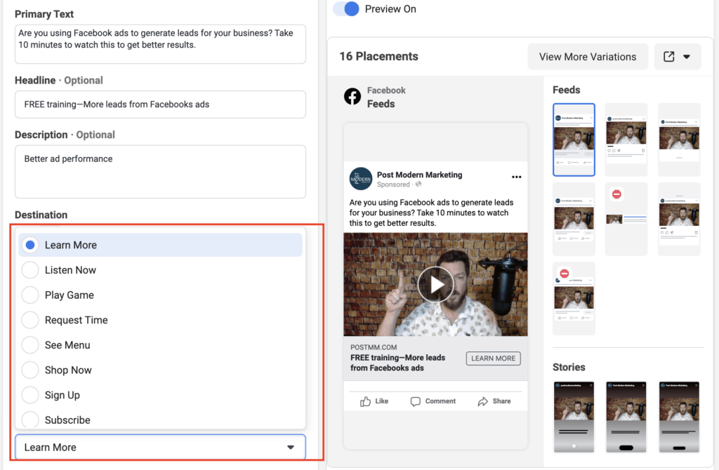
If somebody hasn’t clicked yet, this is your last-ditch effort and likely the least important of the Facebook ad components I’ve addressed thus far.
Here are my go-to buttons:
- Learn More – If you’re not sure, start here.
- Watch More – If you have a video sales letter on your landing page
- Sign Up – If it’s a low-commitment offer like a free ebook, etc.
- Get Offer – If you’ve addressed a problem and built a valuable offer like a free consultation
- Shop Now – For e-commerce, obviously
As I’m A/B testing different ad creative components, this is generally the last thing I’ll test. But, you do have options and they can make a minor—but measurable—difference in CTR.
By now you should have a pretty good read on how all the Facebook ad components work together. But you still might be wondering:
What should I write?
We can’t tell you exactly what to write because every business is unique. But what we can do is give you a proven framework that will help you get a running start on your ad copy.
Bonus—A Proven Copywriting Framework for Facebook Ads
At Nowspeed, pretty much every single Facebook ad we write falls under one of three themes:
- Value
- Relationship
- Scarcity
If you’re not sure what to write, start by writing primary text options that address each of these points. Inject your own style, of course, but stick to these proven topics—your audience is highly likely to go for one of them, and you can A/B test them against each other to see which drives higher CTR and lower CPA.
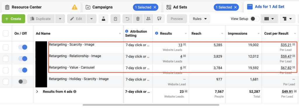
Note that we’ll actually use these themes in the naming convention of our ads. This gives us a quick view in reporting which is performing better. This way, you can run the same image or video with different primary text options and see if it has a positive effect on CTR.
With those three themes, you should never have to worry about what to write ever again!
Remember though—Facebook advertising, or any type of advertising, is only a small part of a comprehensive digital marketing strategy. You’re going to need a lot more if you want to have long-term success.
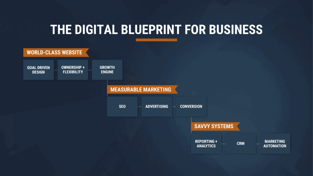
If you’re interested in seeing how Facebook advertising fits into the bigger picture of digital marketing for lead generation, check out our free webinar the Digital Blueprint for Business.
So let's
talk.
We're always excited to dig into the details of your company and what strategy can help you meet your goals. So let's talk and lay out a plan for success!