How to Produce Great Web Design, According to Our Team
We've been a web design company for over 10 years now, and have developed over 300 sites in that time. In that time, we've constantly improved our process to the point where we've got a solid foundation on how we approach projects. In this article, we'll discuss how to know if you need a new website, how to hire a great company, and how we approach projects so they're successful for our clients.
How Do We Approach Our Web Design and Web Development Projects?
Do You Need a New Website?
It's 2019 - by now, we've pretty much established that every company needs a web presence of some sort. Customer behavior is such that once we see an ad or hear about a product or service, we immediately turn to the internet to look it up. Our impression of your company online directly influences our decision as to whether or not we'll contact or hire you. So you've got to be online.
But, how important is it to have a shiny new website that has all the bells and whistles to really "wow" your audience? Most web designers will tell you it's super important: a great new, beautiful website will magically attract new customers and help them convert. But, that's not necessarily true. I've personally seen old websites significantly outperform new ones, for a number of reasons. Here are a few things to consider before making the leap to the new digital age:
Is Your Website Meeting Your Goals?
The most important thing to consider with your website is whether or not it's meeting your goals. If you're a small business that is doing quite well with lead generation or reputation, and your website is a part of that funnel, it might be doing pretty well already even if it's not your flavor of beautiful. Break down what you want or expect your site to do: generate leads, support your message, gather data, sell products and so on: if it's performing well at its function, you may be better of investing your time and dollars at other areas of business that need bolstering first.
Does Your Website Break... like... a lot?
Is your website down every other day due to things like memory errors, hacking, plugins breaking, exploding when you try to change some text? Some of these things might be fixed by better hosting, and some might be because your website was built poorly. I'm going to confess something: developers are lazy - we like shortcuts. Unfortunately, some of those shortcuts cause long-term stability and security problems. So, get an honest opinion from someone who knows their stuff as to whether or not your site needs a few band-aids, or if it needs a full-body amputation.
Did Your Web Developer Disappear?
Something we hear a lot is that web development companies leave projects unfinished. They become unresponsive after some time, or just unable to meet the ongoing needs you have with a website. Then, you're stuck without access or the ability to keep your website updated, and up that veritable creek. At that point, it might be time to cut ties and start over.
Does Your Website Work on All Devices?
You've heard it a million times by now: if your website doesn't work on phones, you're missing a huge chunk of traffic. And this is true - Google powers a vast majority of internet searches and now prefers sites that are mobile-friendly. Not to mention the user experience causing a loss of potential conversions. So, this is an easy one: if your website doesn't work on phones, it's time for a new one.
Is it Really Ugly?
Only now am I getting to the aesthetics of your site. Which hurts me, because I started my career as a graphic designer. But, after almost two decades of building websites for businesses, it pains me to admit that I've seen a good number of ugly websites outperform beautiful ones. There are a few reasons for this:
- The old site was crafted to perfectly meet the goals.
- Sometimes "hokie" or "small-time" support the company's persona (think those cheesy HVAC companies).
- Simple and fast is often better than complex and involved.
- The old site might have been familiar to its users and a new design, even if better technically, alienates them (here's looking at you Reddit, Facebook, and every other social platform that redesigns their interface to look more "modern").
But, if your website is so hideous that your children scream and run from the room when you pull it up, maybe it's finally time for a refresh.
Other Considerations
There are a myriad of reasons to plunge into the process of redeveloping your website. But, make sure to consider things beyond just how it's going to look or work. Is the investment you're going to put into it actually return itself? Will you be able to dedicate the time and energy that's required for a successful process right now? Have you taken the time to develop your company's strategy for marketing that will then support or be supported by the new website first? Make sure you consider all options before you get started on a long, involved process for a new website.
How to Hire the Best Web Design Company
There are a plethora of web development companies out there. I just performed a google search for "web design company" and it returned 1.5 billion results (that's not to say there are that many, but it's a good indicator when it's higher than "clothing company" or "law firm" or "fast food company"). So how do you get through the weeds to find the best one for you?
Lean Local
I firmly believe that in order to have a fully successful web project, you need to be able to meet and communicate with your team. There is something important about taking the time to understand you, as a client, that makes me better at my job. I get to learn your business, your goals, your desired customer, and your persona. And even by forming a relationship with you, I get to better communicate for a smoother web development process.
The other side of the "local" coin is that I firmly believe that the quality of work done by an in-house team is significantly better than that which has been outsourced. Out of the thousands of websites I've seen over the years, it's always the ones developed off-shores that have caused issues. They're cheaper for a reason, and they often show it in performance. I understand that the best firm for you may not be down the street, but work with a team that can communicate (frequently) in your language, understand your goals, and be held accountable to meeting them.
Meet Them and Trust Your Gut
Meet your team! Take the time to visit your web development firm and see if they're a match for you. While we've had many clients who we've, regrettably, never met in person, we always prefer to meet in person. It helps us understand the client better, and we can immediately tell if we're a good fit. If you meet a potential agency or individual and just have that "off" feeling about them, odds are you're probably onto something and should look elsewhere.
Check their Work
Take the time to peruse the portfolio of any firm you're considering. Do you like their work? Are the websites they promote recent, or even still online? Do they even show examples of their work? Anyone you hire should be able to demonstrate their experience and expertise.
Check their References
But don't just leave it at looking at their work. Check their online reviews. But make sure to also contact some of the companies they've worked for to get a sense of what the experience was like. Ask how long the project took and if it was on time. Ask about communication. Were the clients happy? Would they recommend them?
Ask the Questions
The world of web design and development can get really confusing. There are acronyms for just about everything, and no shortage of different software and systems used to build or manage sites. Here are some questions you should make sure to ask any potential web design firm before you decide to hire them:
- Will I have own and have control over my site after it's done?
- Will I be able to host and manage my own site without you?
- Will my site be SEO-friendly?
- How do you ensure I don't lose my Google rankings after the new site goes live?
- Will my site be built responsive for all devices?
- Will my site be using a CMS (content management system), and if so, which one?
- Will you be using a template, or custom-designing my site?
- How long will my website take, and how often do you hit your deadlines?
- Is your proposal price firm, or will there be possibilities for other costs to come up?
- Will my site be built by your in-house staff, or outsourced to contractors or overseas?
- Will you support me after the website is done if I need changes?
- Do you guarantee your work after the website is live if something breaks?
By asking these questions, you'll get a pretty good sense as to the quality of work you'll be getting from the potential web developer, and if they'll be a great fit for you.
Which CMS Should You Use?
There's an eternal argument between developers as to the best way to build a website. Most hardcore web developers say to always custom-code a website (I used to be in that camp), but there are a few compelling reasons to use a content management system: ease of management for the client, ability to have other developers manage or edit the site, security and technology updates, and flexibility in design, content and features.
We exclusively use WordPress as our CMS these days - it's by far the best option for our clients and their needs. But others may have their preferences according to the environment they're most comfortable in and the goals they're trying to meet. Regardless, over 50% of websites today use a CMS, and a large majority are in WordPress. Here's the breakdown of data from the most 1,000,000 popular sites on the web, and which CMS they use (the top 5 are listed here, full data at the link below).
CMS Usage in Top Websites
Goals for You and Your Web Developer
As we mentioned before, your website needs to not only look good, but it needs to achieve something - and preferably something with a positive ROI for your business. Here, we'll break down how to set your goals, and then how to properly gauge and track them.
Setting Your Goals
Your website is your virtual storefront. Or your virtual billboard. Or your virtual community. It can be a lot of things. Each and every website has a goal (or many goals) that it's looking to achieve, and should be built with that in mind. A general breakdown of the most common websites goals is as follows:
Lead Generation
Most common for small businesses, lead generation is the basic, essential function of a website. By driving traffic to the website from organic search, pay-per-click, social media, environmental marketing, outbound marketing and more, your goal is then to convert that traffic into leads. You want people to either call your business or send you their contact information so your sales team can then follow up and close the deal. You do this by increasing trust, offering compelling information or creating user-engaging tools or content to help them make the decision that you are the company for them.
Online Product Sales
Selling stuff is often the core function of a website for any retail brands, manufacturer, or marketing affiliate. You want to drive visitors to your website through your marketing efforts, and then compel them to add your product to their cart or click your affiliate link to then buy something. Your core business model revolves around improving the user experience and lowering the barriers required to get someone to make the decision to buy.
Awareness
Great for non-profits, causes, politics, large brands and other organizations, these types of sites are ones where you don't need users to take action necessarily, but do want to engage them and make yourself known. You want to promote compelling messaging, cool features, helpful and actionable information, and content or tools that engage your users and promote sharing and return visits.
Supplementing the Sales Process
For companies where sales is usually outbound, bid, or referral-based, the website may not be the first touch in your sales funnel. So, your website doesn't need to capture data, but rather convince and compel. Your sales team as already visited the potential customer, or you've been referred, or you've submitted a bid; now your website's job is to convince that customer that you can perform the service offered, and that you can be trusted. These are often portfolio-type sites where the content might be thinner than the imagery and trust signals, but you measure success by your closing rate increasing and getting feedback from those clients.
Advertising or Remarketing
Often seen in news and community websites, the goal is to engage users and get them to return often so you can then display and promote advertising to them. The site should be built to provide a constant stream of fresh, topical information. This promotes return visits, sharing and engagement, which allows for more opportunity to display ads. With more traffic, the value of ads to advertisers increases. These types of sites are also very heavily integrated with social media.
Tracking Your Website Goals
So you've set your goals, and now it's time to figure out how to tell if you've met them. Too often, I hear "business is going well, so it must be working" from clients regarding their new website or marketing campaign. But in this day and age, we have the tools to be very specific with your tracking and they can help you really dig into the effectiveness of your website.
Ways to Track the Goals
The most basic website tracking is installing an analytics platform (usually Google Analytics). This helps you see your traffic, where it's coming from, how it's navigating your website, and if you're getting the behavior your planned for. But beyond this, you can have your developer create a few extra things, depending on your goals:
"Thank you" pages - the final step in the lead or sales funnel, these pages are hidden and only found once a user submits a form or finalizes a purchase. You can track visits to this page as a general idea as to the effectiveness of your website and its ability to covert. Make sure it's not indexed with search engines and not able to be crawled by bots, though - you don't want false positives coming from outside sources!
Conversion tracking - if you're running any search ads or social ads, make sure you're using proper conversion tracking with their "pixel" or "tags" to follow users from their ad to completing a form on your site. Too many companies forget this basic feature to measure their advertising success.
Dynamic phone numbers - one of my favorite ways to track website goals is through phone tracking. Any service-based company or local business should consider installing a system where the contact phone number on your website changes according to how the user got to it. This helps you determine if you're meeting your goal by separating phone calls from your online profiles from that of paid campaigns to direct traffic, and even organic traffic.
Social shares - if awareness and engagement is your goal, make it as easy as possible for users to share your content on their social feed. This is usually seen by social share icons, which should be tied to your social media accounts to track engagement of your content.
A/B testing - a little more complicated to create and manage, but if you are spending large budgets on internet marketing, it may be worth your investment to use or create a system where you can compare different versions of your web pages to see which performs better. This is best for paid campaigns, as you can dynamically change the landing page the user sees and track each version separately. Don't do this for organic search - you can really mess with your rankings this way if you're not very, very careful.
Don't Forget Your Old Website
It may be worth your time and investment into having your web developer take the time to install the same kind of tracking on your old website. This will not only allow you to get an understanding of what's working now, but also give you a baseline to compare your new website once it's live and running. You might find opportunities where your old website was finding success that your new one overlooked - it happens and that doesn't mean you or your developer failed - it's part of the ongoing process of improving and managing a new website.
Websites we've designed and their goals
We pride ourselves in our ability to great great looking websites that meet our clients' goals. We're fortunate that most of our clients choose to have us manage and maintain their websites long-term after they're done, so we're able to offer examples of sites we've built, the goals they had, and if they met those goals over time.
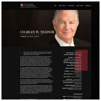
Client: Trainor Fairbrook
Goals: More traffic, promote attorneys
Results: Site traffic up 40%
Everyone in commercial real estate in Sacramento knows Trainor Fairbrook. The goal of their new website was not lead generation, but to promote the expertise of their attorneys through compelling profile pages and generating organic traffic through articles and informative content. As of the new site launch, the year-over-year traffic is up 40%, and the attorneys have a much better, engaging profile page that has been effective in bolstering their reputations.
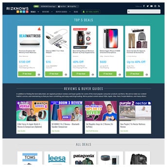
Client: RizKnows
Goals: More organic traffic, more affiliate sales
Results: Organic traffic increased to 200k/mo.
RizKnows made affiliate marketing work through hard work and commitment. When we built their website, they were getting about 7,000 organic visits to their site per month. Not two years later, they're getting 200,000 visits and rank on the front page for most of their targeted topics.
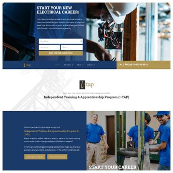
Client: I-Tap
Goals: More leads
Results: A lot more leads
I-tap came to us for a new website, hoping to increase the leads they received for people interested in becoming electricians. Through better conversion optimization, SEO and marketing tracking, their leads skyrocketed over the last year and they now fill their classes regularly.
Rethink Your Interior Pages
Most websites seem to follow a similar design philosophy: a compelling, well-designed home page, and then interior pages with a common header and (possibly) sidebar. All of the design time and energy is spent on the home page, but with the way search and user behavior works now, the home page may not be the first that a visitor sees!
Each main landing page should be crafted to compel the visitor towards your goals. Put extra effort into designing the web page to be visually appealing, to answer the questions the visitor might be asking when visiting, and to engage and push them toward conversion.
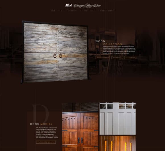
With our client, Carriage House Doors, each interior page was created to tell a story through visuals and animation, just like the home page does. We wanted every visitor's first impression to give the same vibe, to promote the same brand, regardless of how they entered the site.
The Website Development Process
We've worked really hard over the years to craft, improve, completely discard and rebuild, and hone the web development process. The only way we, as a web design firm, can complete projects and stay profitable is to have a strict system for the success of each project. We build more websites than anyone in our region, by far, and that's a testament to our team and process. Here's a breakdown of our approach:
How Long Does a Web Design Take to Complete?
The short answer, for us, is websites take 90 days on average from start to completion. This can vary according to the complexity of the development, and more importantly, the interaction with the client. But we've got our process down fairly well where our project manager can track the site from start to finish using the general guidelines:
Discovery and Kickoff - 2 weeks
Every website design project starts with discovery, in which we gather information about your business and industry, so we can better cater to your audience. We then hold a kickoff meeting, asking you questions about your needs, priorities, and goals.
Homepage Design and Development - 3 weeks
The very first thing we design is the homepage, as this will set the tone and style for the rest of the site. We'll work side by side with you to get your message across, while giving customers what they need to ensure we meet your goals. We go through several iterations in-house with our design, development and marketing teams to ensure that when the client receives the developed home page, it's the best we felt we could provide.
Client Review - 1 week
We send the client a live version of the home page, and they'll be able to try it out in any browser they'd like, get a feel for it, and then give us feedback and change requests based on their experience. We usually hit the mark with our first version (well, the first the client sees), but we take feedback and criticism well, and make sure that our clients are happy - and we provide sound reasoning for any decisions we made with the design.
Content Gathering and Generation - 3 weeks (during initial design)
While it’s great to have an awesome-looking website, content is one of the most important elements for any successful website design. Our in-house writers work with our clients to gather and/or develop content that describes their services and expertise in an informative and search engine-friendly manner.
Interior Page Design and Development - 3 weeks
Once we approval for the homepage, we implement page designs for services, products, blog posts, staff bios, and any other necessary pages, and fill them with existing or new media, optimizing as we go to ensure the best experience for users.
Client Final Review - 1 week
The client then gets a fully-complete website to review. The live version has been vetted by our teams, but we know that our clients are experts in their businesses far more than we will ever be, so we need their feedback and critique to make sure everything is just right.
Quality Assurance Review - 1 week
After we get final blessing from the client, we go through a thorough in-house process to check the website on all devices, all browsers, and do our best to break things so we can make sure there are no gaps in the process, no links going nowhere, and no errors causing issues.
Website Launch - 1 week
With all pages built and content in place, we will host the website ourselves, or set the site up on a host of our client's choice. Once redirects and other technical necessities are in place, we'll then take the site online and ensure that it's running well and effectively by keeping an eye on it over the initial time it's launched.
Our Approach to the Design
While we love to make beautiful, compelling websites, sometimes the prettiest website isn't the most effective. So it's incredibly important to find a balance between form and function. Does the website need to look modern and attractive? Yes, but not at the expense of getting the visitor to click that "contact us" or "purchase now" button.
So we have a few principles we follow with every design, even when it's not immediately evident when you first see the design:
- Establish the most important goal and make sure that it sticks out
- Establish the message of the web page and make sure it's most prominent through text and imagery
- Design around those two items, not over them, with the other less-important sections
- Supplement the message through trust signals, compelling imagery and readable content
- Don't make it difficult to find the important parts of the page - the menu, the buttons and the answer to the visitor's question
- Don't be limited to the typical "template" feel out there! We have so much real estate on a web page these days, let's use it!
- Create designs that can translate well to all devices.
From there, we let our designers run wild and try new things out. Whether it's a new approach to how the structure is laid out, more compelling typography, or new takes on imagery or animation - we want to designers to be able to express their vision for the site that they received from their time sitting with the client in the design meeting.
But it doesn't stop there. We then have our marketing team go over the design. We've found that our designers and marketers have completely different perspectives and takes from our interactions with the clients. By having both teams give their input and feedback, we strike a great balance between quality design and purposeful functionality.
Our Approach to the Development
We believe that a successful website project means that we can hand a great site over to a client for them to manage easily, that the website has a long lifespan before it need any major changes (roughly 5 years on average), and that the website will perform better than the competition. How do we make sure to meet these goals?
No "black box" Coding
We develop our sites using a CMS (WordPress in our case), so that we know that our clients can hand their site over to their in-house team or other preferred developer to manage and maintain the site with no troubles. We don't use proprietary systems that prevent the client from controlling their own website.
We take it one step further, however, and make sure that all of our custom code is notated properly, organized with best practices, and not overly complicated.
Client Training
We ensure that at the launch of every website, we sit down with our clients and train them how to manage their own website. We walk them through the steps to edit content and images, create new pages, access their data and make other day-to-day changes. We also record videos of our team navigating the site in case the client needs a refresher, or needs to train new staff in managing the site.
Best Practices for Speed
For some time now, Google has been using website speed as a ranking factor. This fact alone makes it important that the websites we build are fast and optimized, but we also want to consider the user experience and the device they're accessing the website on. We build our sites to require as little resource loading as possible, optimize our images, and minify our scripts whenever possible.
Best Practices for SEO
We make sure that, when SEO is important for a website, we follow all best practices with page structure, content breakdown, site crawlability, proper tagging and schema, and other relevant features we have to consider. There are some sites where SEO isn't as important, and we can be a little more flexible in our design (especially to the way content is laid out), but for the most part, we want your site to be optimized first for the user experience, and second for the robots.
Minimal Dependency on Third-Parties
Nothing irks me more than having a client with website issues from a previous developer have me log in to find that they were using unlicensed software that hasn't been updated in years. We use a very minimal amount of third-party plugins on our WordPress sites (our average site uses about 5 in total - all reputable and highly-supported) and make sure that any that we do use have proper licenses so our customers don't have issues down the road.
The anatomy of our websites
We have a strict approach to how we build our websites to ensure that the site looks great, is easy to use, runs fast, and is stable, long-term. Here are the systems and plugins we use for all our sites.

WordPress, as mentioned above, is by far the most popular CMS on the market. It's supported by a great community, constantly updated, and ever improving and growing. By building our sites in WordPress, we know our clients can find any number of developer to support them (though most choose to stay with us). We don't ever want a client leveraged by our technology and forced to work with a specific firm or custom web system.
Beaver Builder is a great WordPress plugin that allows us to have a lot more flexibility in design. We're no longer stuck with using a theme or going through costly code revisions to make design changes on a site. In addition, our clients now have a front-end editor where they can see what they're changing, and make edits easily without risking breaking code or the structure of the site. It's a huge time saver for them, too!
StudioPress Genesis is the framework we use for our sites, and we create a custom child theme that doesn't drive anything design-related, just page structure and features. We don't like themes that require on a ton of external scripts or plugins, or break with updates. Genesis is lightweight and efficient.
Gravity Forms is our preferred plugin for forms. It's flexible, well-supported and documented, and allows functions and calculations that other forms don't handle well.
Google Tag Manager is a great way to manage and install various scripts for analytics, conversions, tracking, and other purposes on your site without having to go crazy and install them one-at-a-time sitewide or on a per-page basis.
Yoast SEO helps us easily manage things like sitemaps, meta titles and descriptions, and other SEO-related tasks.

WPEngine is our host of choice. They specialize in WordPress websites and have always had stellar support, fast servers, and great tools and functionality.
And that's it for most of our websites. We keep dependencies on third-party themes or plugins to a minimum so we don't have to worry about deprecated or unsupported plugins causing compatibility issues, security vulnerabilities, or other problems long-term.